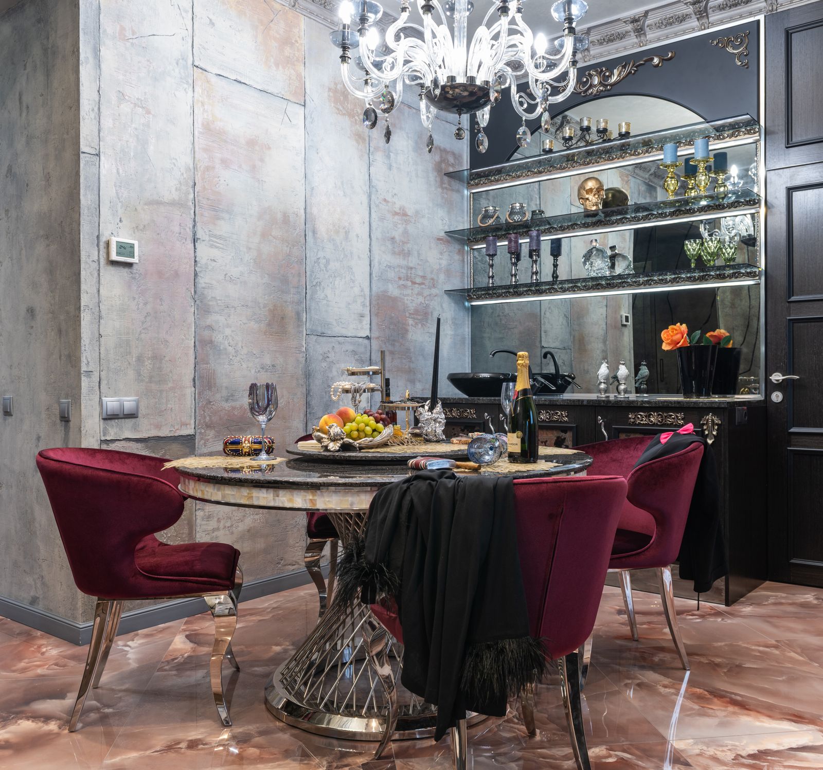
Warm white
A softer, warmer appearance often considered for homes, hospitality spaces and relaxed interiors.
About / Selection guide
Straightforward considerations for comparing LED fixtures, signage formats and chandeliers without requiring specialist lighting knowledge.
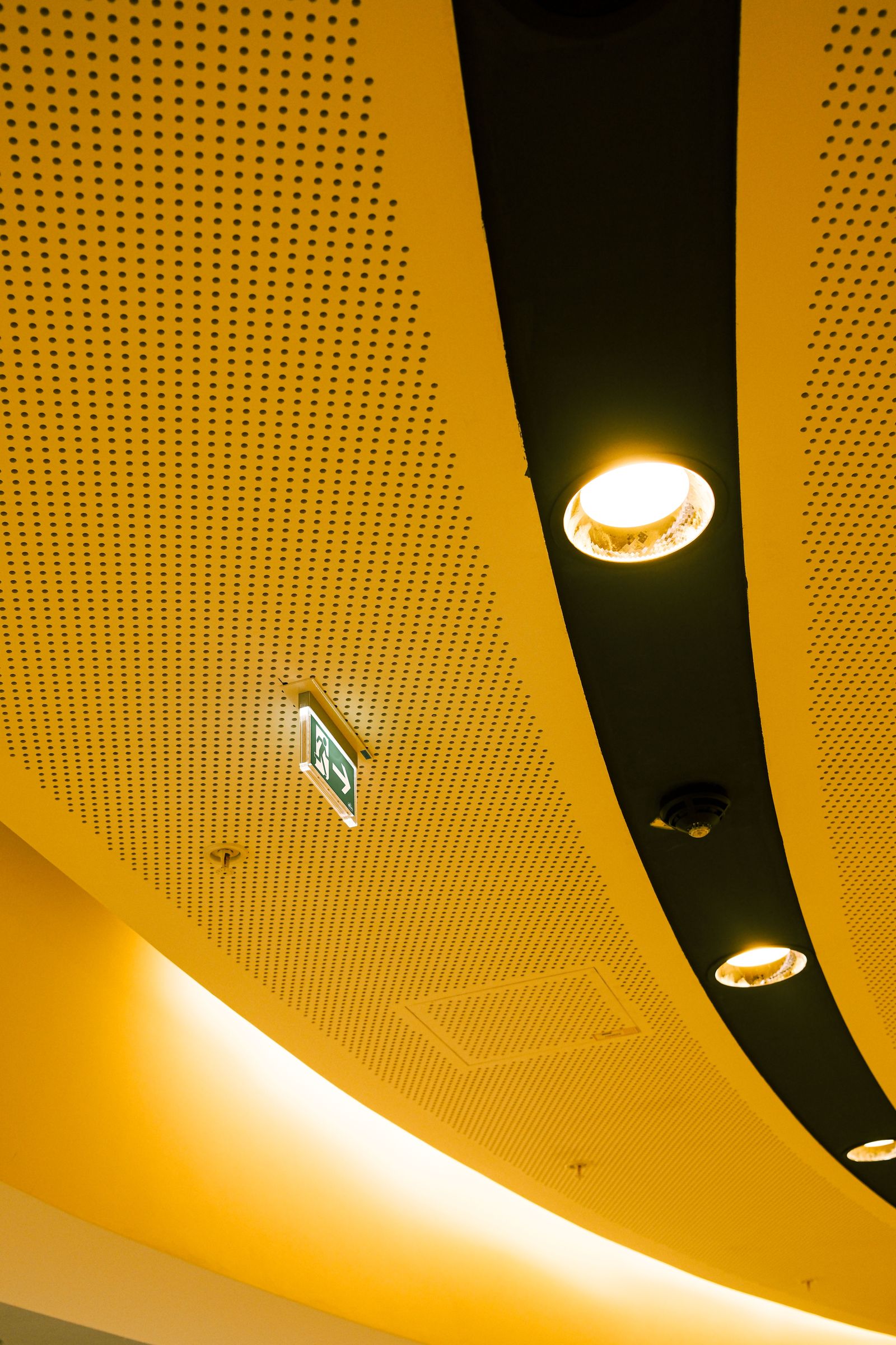
LED lighting
Begin with where the fixture will be used, what needs to be visible and how the light should feel. A retail display, office, hallway and living room can call for different distribution and appearance.
See LED lighting categories for application-specific examples.
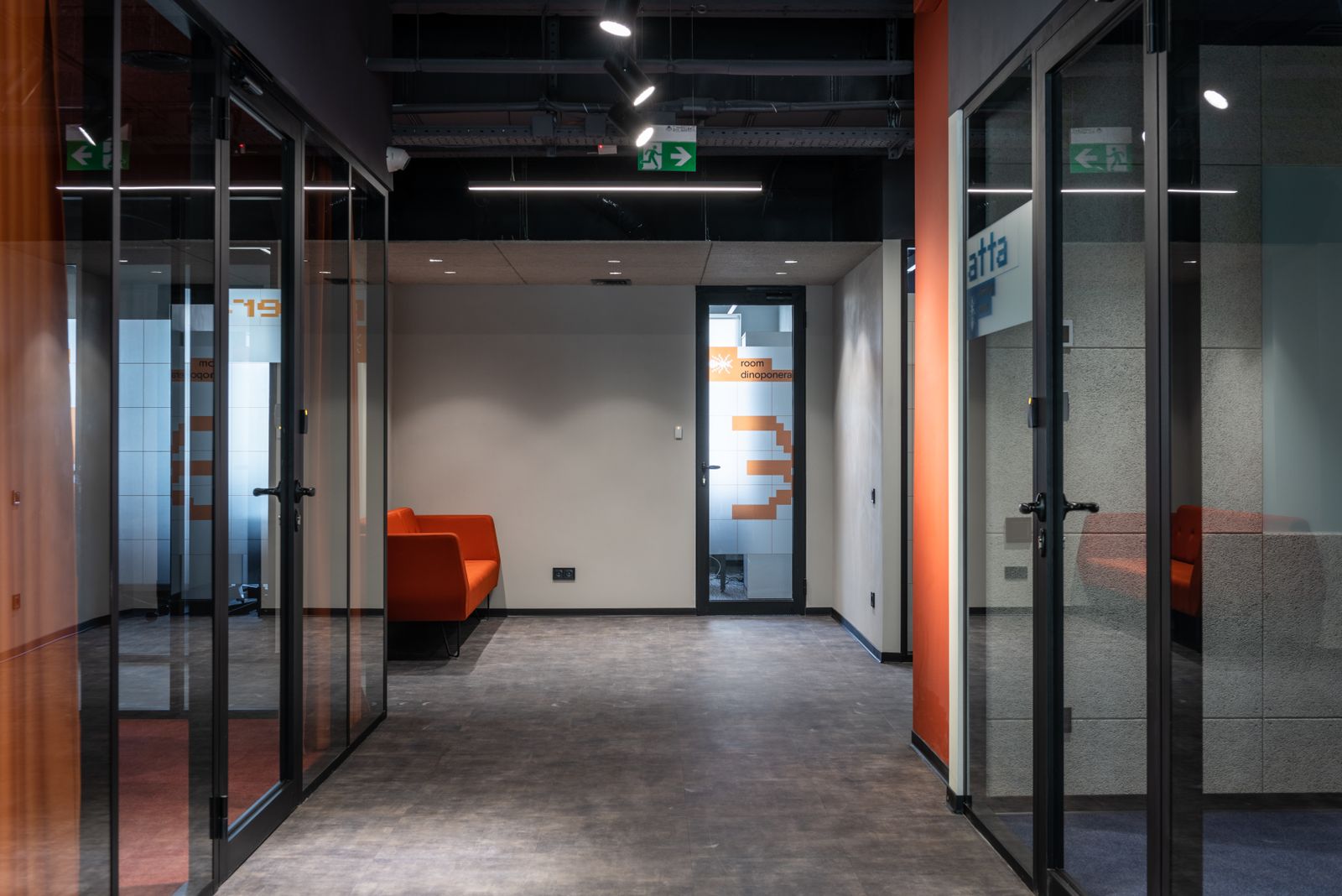
A softer, warmer appearance often considered for homes, hospitality spaces and relaxed interiors.
A balanced white appearance that can suit workplaces, retail settings and everyday task areas.
A crisper appearance often considered where visual clarity and a brighter character are priorities.
Comparison points
Describe light output. Compare lumens when considering how much visible light a fixture provides.
Describes electrical power use. It should not be treated as a direct measure of brightness.
Confirm the product can fit the ceiling, wall, recess or suspension area available.
Describes how narrowly or broadly light is distributed from a fixture.

Commercial signage
Dimensional letters commonly considered for storefront names and building identification.
Useful when identification needs to remain visible after dark.
Freestanding formats considered for site entrances or visibility from surrounding roads.
Used for reception identification, wayfinding, branded walls and window applications.
Explore the complete commercial signage range.
Chandeliers
Consider room width, ceiling height, furniture placement and the sightlines through the space. A fixture should have enough visual presence without interrupting comfortable movement beneath or around it.
Compare chandelier styles and applications before sending room dimensions with an enquiry.